


Dyslexia-Friendly Fonts: Do They Help?
Do dyslexia friendly fonts like OpenDyslexic work? 15 studies say no. See which fonts and spacing actually help, and how to set them up on any device.
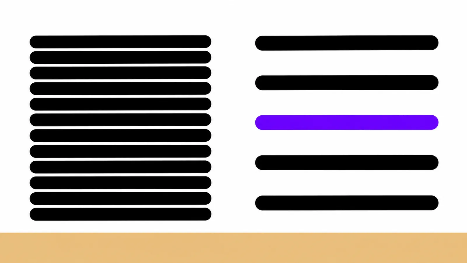
No. Dyslexia friendly fonts such as OpenDyslexic and Dyslexie don't make reading faster or more accurate; a 2026 meta-analysis of 15 studies found no reliable effect. The best choice is a plain font you like, such as Arial, Verdana or Calibri, set larger with extra letter, word and line spacing.
A 2026 meta-analysis of 15 studies and 688 participants, mostly children, found that dyslexia fonts had no reliable effect on reading speed or accuracy.
Where Dyslexie seemed to help, the extra spacing explained the gain, not the special letter shapes.
Spacing has the strongest evidence: extra-wide letter spacing roughly halved reading errors for children with dyslexia in a 2012 study.
A plain, familiar font such as Arial, Verdana or Calibri, at a comfortable size with 1.5 line spacing, is a solid default.
Comfort still counts. If you prefer a dyslexia font, use it, but don't expect it to replace reading instruction or other support.
Dyslexia friendly fonts like OpenDyslexic and Dyslexie promise easier reading, but the research is consistent: they don't help people with dyslexia read faster or more accurately than ordinary fonts like Arial. What does help is spacing, size and layout, and you can set those up in a few minutes on most devices.
Below: what the studies found, which fonts are worth using, the spacing settings that matter, and how to change them on iPhone, in Chrome, in Word and on Kindle.
Do dyslexia friendly fonts help? What the research says
No, not in a measurable way. The strongest evidence is a 2026 meta-analysis in Annals of Dyslexia that pooled 15 studies with 688 participants, mostly children. It compared dyslexia fonts such as OpenDyslexic and Dyslexie with Arial and Times New Roman and found "no consistent or reliable effect" on reading speed or accuracy. The overall effect was essentially zero.
The individual studies point the same way:
| Study | Who took part | What they compared | What they found |
|---|---|---|---|
| Wery & Diliberto, 2016 | 12 students with dyslexia, grades 3–6 | OpenDyslexic vs Arial and Times New Roman | No gain in speed or accuracy (scores were slightly lower); no student preferred OpenDyslexic |
| Kuster et al., 2018 | 170 children with dyslexia, then 102 with and 45 without dyslexia | Dyslexie vs Arial (and Times New Roman in part 2) | No advantage; most children preferred the standard fonts |
| Marinus et al., 2016 | 39 low-progress readers | Dyslexie vs Arial, and vs Arial with matched spacing | 7% more words per minute in Dyslexie, but no significant gap once Arial got the same spacing |
| Azzarello et al., 2026 | 15 studies, 688 participants | Dyslexia fonts vs standard fonts | No reliable effect on speed or accuracy |
The Marinus study is the most revealing. Dyslexie did help a little, but only because it is set wider than a normal font. Give Arial the same spacing and it works just as well.
One more detail from the Kuster study matters: children's font preference didn't predict how well they read. Liking a font and reading better with it are two different things.
What are dyslexia friendly fonts?
The term covers two different things, which is why search results can be confusing.
- Specialized dyslexia fonts were designed for readers with dyslexia. OpenDyslexic and Dyslexie both give letters heavier bottoms, which their makers say keeps similar letters from seeming to flip or blur together. Dyslexie is also set wider than a typical font. Sassoon Primary, a handwriting-style school font, often appears on these lists too.
- Everyday fonts that dyslexia guides recommend are ordinary, plain fonts that many readers find comfortable. Dyslexia Scotland names Arial, Verdana and Calibri as popular sans serif choices and says monospaced fonts like Courier can also work.
Dyslexia Scotland puts it plainly: "There is no one-size-fits-all 'dyslexia-friendly' font."
What is the best font for dyslexia?
A plain, familiar font you like, set with generous spacing. No font has been shown to beat the others, so these are reasonable options to try rather than a ranking:
| Font | Type | Where to get it | What to know |
|---|---|---|---|
| Arial | Plain sans serif | Comes with Windows and Mac | The comparison font in the studies above |
| Verdana | Wide sans serif | Comes with Windows and Mac | Roomy letters and spacing built in |
| Calibri | Sans serif | Comes with Microsoft Office | Named by Dyslexia Scotland as a popular choice |
| Comic Sans | Rounded sans serif | Comes with Windows and Mac | Often on dyslexia lists; no strong evidence it beats other plain fonts |
| Lexend | Adjustable sans serif | Free from Lexend and Google Fonts | Built to improve reading proficiency; its site cites a small study of 20 third graders |
| Atkinson Hyperlegible | Sans serif | Free from Braille Institute | Designed for readers with low vision, with letters that are easy to tell apart |
| OpenDyslexic | Dyslexia font | Free from opendyslexic.org; built into Kindle | Studies found no gain over Arial |
| Dyslexie | Dyslexia font | Paid font by designer Christian Boer; free typeface-only Chrome extension | Its small benefit came from spacing, not letter shapes |
Whichever you pick, the spacing settings in the next sections matter more than the font itself.
Why don't special letter shapes help?
Because for most people, dyslexia isn't a problem with seeing letters. The International Dyslexia Association defines it as a specific learning disability that affects word reading and spelling. The core difficulty is linking letters to their sounds quickly and accurately, which a new letter shape can't fix.
The belief that dyslexia is mainly a visual problem, with letters that seem to flip or reverse, goes back almost a century. As Edutopia explains, early observations of children reversing similar letters helped fuel it. Decades of research since then point to sounds, not sight, as the main barrier.
Unfamiliar fonts can even cost a little effort. Dyslexia Scotland notes that familiar fonts can reduce cognitive load, and it advises against decorative and slanted fonts, which crowd letters together.
What actually makes text easier to read with dyslexia?
Spacing has the best evidence, then size and layout.
Spacing. In a 2012 study in PNAS, 74 Italian and French children with dyslexia aged 8 to 14 read text with extra-wide letter spacing. With no training at all, they made about half as many errors and read a little faster. Younger children without dyslexia, matched on reading level, didn't get the same boost. The researchers linked the effect to crowding: when letters sit close together, they interfere with each other, and readers with dyslexia seem especially sensitive to that.
That fits Dyslexia Scotland's conclusion that "letter, word and line spacing combined, not style" is what makes text easier to read. Here are the settings it and the web accessibility standard (WCAG) recommend:
| Setting | Recommended | Source |
|---|---|---|
| Font | Plain, evenly spaced; avoid decorative and slanted fonts | Dyslexia Scotland |
| Size | At least 12 pt; larger often helps | Dyslexia Scotland |
| Line spacing | 1.5 | Dyslexia Scotland, WCAG 1.4.12 |
| Letter and word spacing | Wider than default, by roughly 30–35% of the font size or to taste; word spacing at least 3× the letter spacing | Dyslexia Scotland |
| Spacing your text must handle | Letter spacing 0.12× and word spacing 0.16× the font size, without breaking the layout | WCAG |
| Line length | About 50–75 characters; shorter can be easier | Dyslexia Scotland |
| Alignment | Left-aligned, not justified | Dyslexia Scotland |
| Colors | Dark text on off-white or cream rather than stark black on white | Dyslexia Scotland |
| Paragraphs | About five lines, with bolder, larger headings | Dyslexia Scotland |
Preferences vary, so treat these as a starting point and adjust to what feels easiest. For more everyday strategies, see our reading tips for adults with dyslexia.
Should you use a dyslexia font anyway?
If you like one, yes. A font that feels calmer or friendlier can make you more willing to sit down and read, and that has value even if it doesn't change your speed or accuracy.
Just keep three things in mind:
- Don't expect a fix. A font won't change how quickly you decode words. If reading is still slow and tiring, look at spacing, listening support and reading instruction.
- Test, don't assume. Read the same page in your favorite font and in Arial with wider spacing. Time yourself, or notice which one tires you less.
- Be careful with children. A font promised as a solution that doesn't deliver can leave a struggling reader more discouraged. Present it as a comfort choice, not a cure.
How to make text dyslexia friendly on your devices
You don't need to install anything to get most of the benefit. These built-in tools change font and spacing for whatever you're reading:
- iPhone and iPad (Accessibility Reader): turn it on in Settings > Accessibility > Read & Speak > Accessibility Reader. Open it in any app from Control Center, the Share button or the Accessibility Shortcut (triple-click the side button). Then tap More > Customize Reader, pick a theme and tap Edit to change Text Size, Font, Line Spacing, Word Spacing and Character Spacing (Apple's guide).
- Chrome on a computer (Reading mode): right-click a page and choose Open in reading mode. Under its Settings you can change Font, Line height, Letter spacing and Color theme, and turn on Line focus (Google's help page).
- Microsoft Word (Immersive Reader): go to View > Immersive Reader. The ribbon offers Column Width, Page Color, Line Focus, Text Spacing, Syllables and Read Aloud (Microsoft support).
- Kindle: Amazon added OpenDyslexic as a font on Kindle, Kindle Paperwhite, Voyage and Oasis e-readers and in the Kindle app for iOS. Open a book's display settings (the Aa button) to choose it; the fonts you see depend on your device.
Making your own handouts or documents in Word
If you write worksheets, notes or letters for a reader with dyslexia, set up the page itself:
- Select your text and choose a plain font such as Arial or Verdana at 12 pt or larger.
- On the Home tab, select the Font dialog box launcher, open the Advanced tab, set Spacing to Expanded and enter an amount in the By box (Microsoft's steps).
- Go to Home > Line and Paragraph Spacing and choose 1.5.
- Left-align the text, keep paragraphs short and use bold headings.
Our guide to assistive technology for dyslexia covers more tools, from reading rulers to dictation.
When the font isn't the problem: try listening
If you've tried fonts and spacing and reading still drains you, the bottleneck is probably decoding, not the page. Hearing text read aloud while you follow along takes that load off, so your energy goes to understanding. Our guide to how text to speech helps with dyslexia explains the research.
Speechly is a text-to-speech reader for iPhone, iPad, Android, Mac and Windows. It's a reading tool, not a treatment for dyslexia.
- Follow every word: each word is highlighted as it's read, and you can jump to any sentence.
- Any text: open PDFs, Word files, EPUB books and web pages, or take a photo of a book page or worksheet and listen to it.
- Your pace: choose from 25+ natural voices and set the speed from 0.5× to 2×.
- On a computer: select text in any app and press ⌘E on Mac or Alt+R on Windows.
The free plan includes two files with premium voices, no card required. Premium is $14.99/month or $139/year and covers every device. See how Speechly works for readers with dyslexia, or get it on iPhone.
The bottom line
Dyslexia friendly fonts don't make reading faster or more accurate, and the research on that is now consistent. Spend your effort on bigger text, wider spacing and a clean layout, use any font you find comfortable, and add listening support when the words themselves are the hard part. If reading is a struggle for you or your child, an evaluation and structured reading instruction are the most important next steps; our guide to what dyslexia is explains where to start.
Frequently asked questions
Is Lexend good for dyslexia?
Lexend is a free, plain font built to improve reading proficiency, and its creators report faster reading in a small study of 20 third graders. That's promising but limited evidence, so treat it like any other clean font: try it with wider spacing and keep it if it feels easier.
Does OpenDyslexic actually work?
Studies so far say no. In a 2016 study of 12 students with dyslexia, OpenDyslexic didn't improve reading speed or accuracy compared with Arial or Times New Roman (scores were slightly lower), and none of the students preferred it. A 2026 meta-analysis reached the same conclusion across 15 studies.
Is Comic Sans good for dyslexia?
Comic Sans often appears on lists of dyslexia friendly fonts, but there's no strong evidence that it beats other plain fonts. If you like it and it feels easy to read, it's a reasonable choice.
Are serif or sans serif fonts better for dyslexia?
Dyslexia Scotland says there's no consistent advantage of sans serif over serif fonts. Many people with dyslexia prefer sans serif, so it's a sensible default, but spacing matters more than whether a font has serifs.
Is OpenDyslexic free?
Yes. The OpenDyslexic website says there are no mandatory fees, and the newest version uses the SIL Open Font License, which allows uses including education and commercial projects. It's also built into Kindle e-readers as a font option.
Can a font cure or fix dyslexia?
No. Dyslexia is a lifelong difference in how the brain processes written language, mostly linking letters to sounds. Fonts and layout can make text more comfortable, but structured reading instruction and accommodations are what build skills and access.
Listen with Speechly
Natural AI voices on iPhone, iPad, Android, Mac and Windows, with word highlighting and your place saved on every device. Free to download.
Prices and features of other products were checked on November 18, 2026 and can change. Speechly is not affiliated with the other companies named here.

Reading Tips for Adults with Dyslexia: 15 Strategies That Help
15 reading tips for adults with dyslexia: free read-aloud tools you already have, text layouts that help, work reading tricks and what research says.

How Text to Speech Helps with Dyslexia
How text to speech helps with dyslexia: 7 ways it eases reading, what the research really shows, and the free settings to turn on today on any device.
Assistive Technology for Dyslexia: A Complete Guide
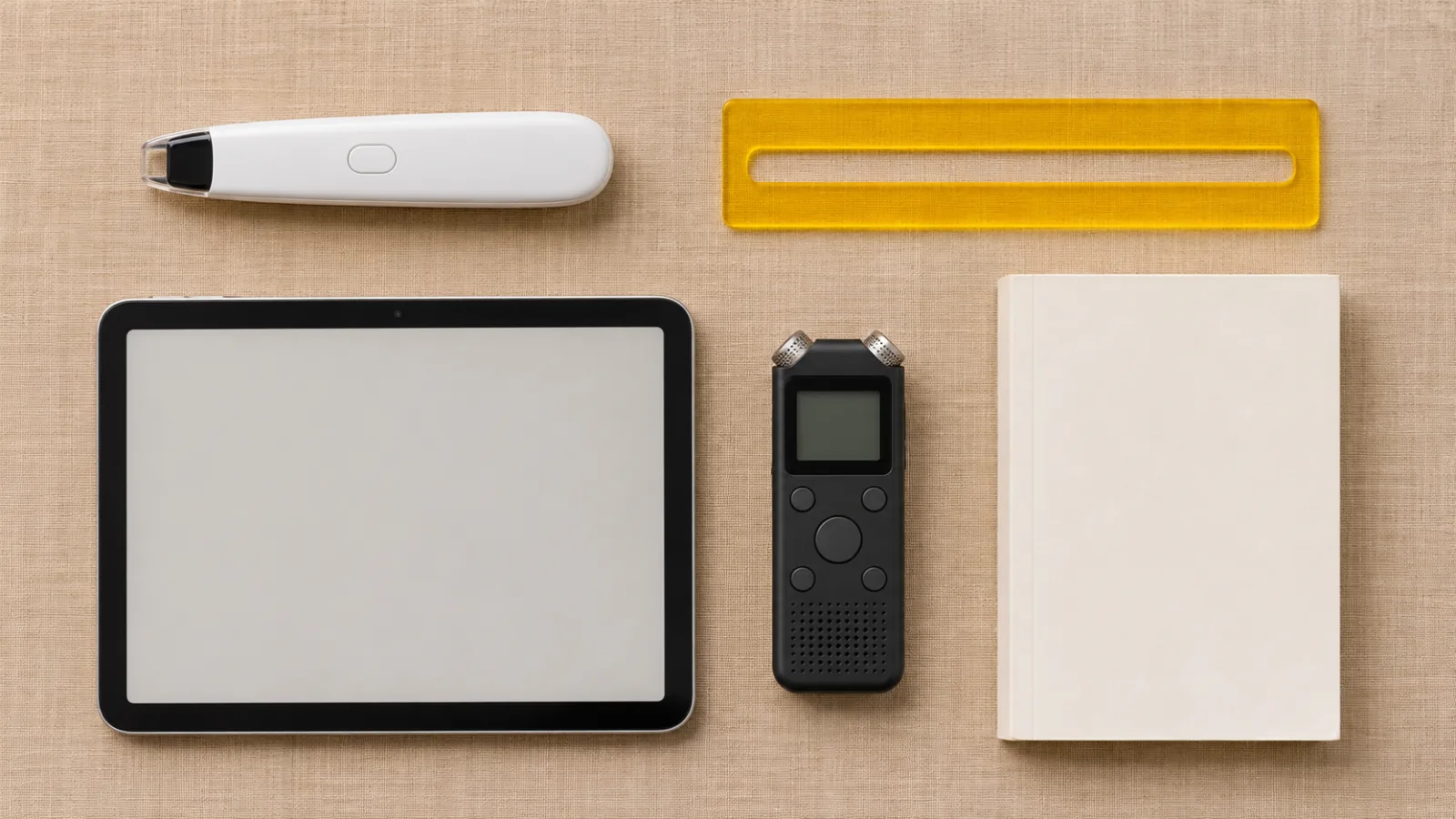
Assistive technology for dyslexia by task: text to speech, dictation, reading pens and audiobooks, the free tools on your devices, and who pays for more.